wonder-bar. candy never looked so good. spandex and florescent colors? delish! by kv
Month: July 2009
ASK: gabi- fashion designer- threeasfour
HAKKIN SAKE
the other night i was given a bottle of hakkin sake, designed by kenya hara, and i’m very excited about finally tasting it. this sake, available for approx 10,500 yen (equal to roughly 120USD), is currently unavailable in the US and it is made the traditional way which is seldom the case these days.
hakkin is brewed the traditional way in wooden oke barrels, a labor-intensive process brought back at masuichi after a half century absence. hakkin is a historic sake which ranked highly in the all japan sake rankings at the start of the meiji period becoming an icon of a name.
specs: rice / kinmon nishiki
polishing rate / 59%
density / +10
alcohol / 16.4%
storage / keep in a dark place at 18 or below and serve within one month.
750ml, 1800ml
the best way to keep the HAKKIN SAKE is refrigerated. expiration date is 1 to 2 month after the manufacturing date. the manufacturing date is printed on the label. but after 1-2month the hakkin sake will only deteriorate in flavor. it will still be drinkable. by dd
Kenzo/Hakkin: what do you know?
the new perfume from kenzo, i discovered, was designed by japanese designer kenya hara. hara indeed used a bottle he had previously designed for hakkin sake as a basis for this. he describes the process of designing the bottle, and i must say i relate to so much of what he says:
“i designed a very simple bottle for sake called hakkin. and i realized what i was expected to do here. what i had in my mind may have been an image of design for 720ml. by changing the size, the liquor bottle can become that of perfume or vice versa without altering the shape or design.
“the bottle was beginning to form its shape but we then needed to work on the package. perfume is usually displayed on the shelf in accumulated manner so the boxes needed some creativity without over doing them. after consideration, we decided to make the box with a slight angle of inclination toward the top. by doing so, there creates some space for lights to come in from above when the boxes are displayed together. this very minor change created a tremendous effect to the box and the display, i persuaded strongly to use this idea for the box. It actually turned out to be a bit difficult to make this box with inclination but it came out nicely at the end thanks to the package manufacturer’s efforts. the package may look simply plain, but we carefully planned every detail such as paper which was chosen by its touch and texture. for the paper, we decided to use something with special features which i created in the past. this paper is unique in a way that letters become dented and semitransparent after printing. we wanted to use this paper for the box and found something of similarity in european market.”
“kenzo is a brand of colors, but i only use colors when necessary because i am a designer of “emptiness”. of course i use colors as communication method such as using red for fire extinguisher or for essential buttons on machines, but i minimize the usage as much as possible for other purposes such as design. if i am to use metal, i will use its original metallic color. when using the glass, paper or whatever the material would be, i will use their original colors. upon printing words on the product, t will use black prints without any question. as I am always piling up simple ideas as such for my designs, the design that i presented for this project too was not colorful.” by dd
Raquel Zimmermann on horse
NY: governers island: where to go on sundays
we know where we’re having our sunday picnic: on new york’s governors island. go early and rent a bike, bring your blanket and a good book and a big basket with a bottle of rosé, a french baguette, some sweet cherries and lots of cheese. way to love summer in the city. by kv
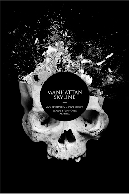
øya festival’s club night
ask: carlos suarez- NY socialite/restaurateur- bobo
the many hats of siri tollerød
model siri tollerød in rome for a shoot with photographer by karen collins by dd
Cathy Daley – doll parts

Cathy Daley was born in toronto in 1955. by kl
 a visual collective outlet of inspiration


