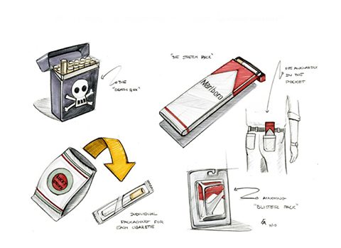
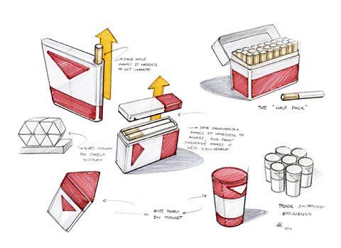
a theoretical look at designing inefficient packaging. a project i found online by erik askin that deals with designing “bad” packaging to make smoking more annoying.
what if to discourage smoking, cigarette cartons were designed to be less convenient? in 1940 raymond leowy re-designed the packaging and logo for lucky strike cigarettes revitalizing the brand and bringing great success to the company. the standard flip-top cigarette box is an excellent design. in terms of presentation, accessibility, and branding, a pack of cigarettes is fantastic. currently, cigarette companies are required to put warnings on their packages about the dangers of smoking. what if we took it a step further?
first, what makes the cigarette carton such a good idea? 1) convenience. cartons allow smokers to easily access and store cigarettes, and the design is easy to manufacture. 2) branding. the logo orientation and point of purchase display provides excellent brand advertising and turns the area behind the register into a huge billboard. 3) portability. cartons fill well into our daily lives by accommodating items such as wallets and cell phones, and fit easily into our pockets.
within reason, how impractical can we make cigarette cartons?
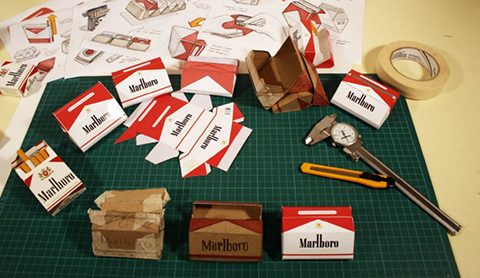
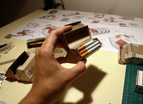
by testing out different orientations, sizes, and flip tops, the least-ergonomic and least efficient design within reason was discovered…
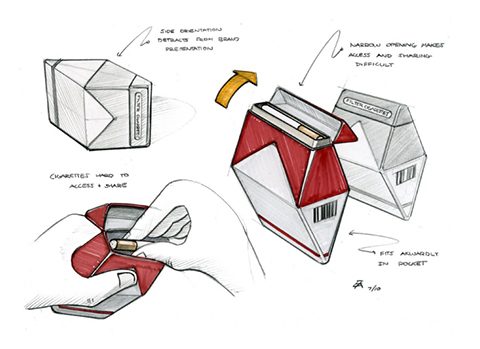
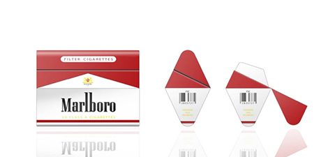
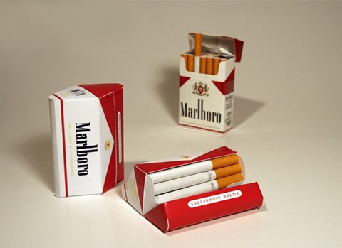
“the diamond carton”
by addressing issues such as accessibility, portability, branding, and manufacturing, the diamond carton makes life subtly harder for smokers.
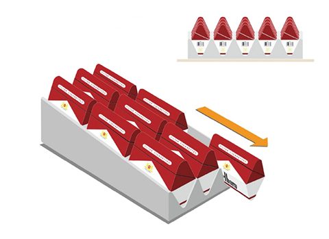
the box’s physical orientation makes it hard to display the logo and brand.
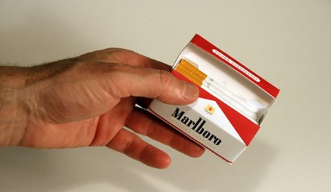
the orientation and taper of the carton, makes access and sharing difficult (some might say that is a positive thing).
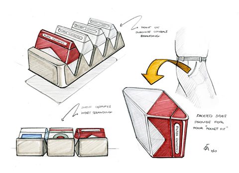
the multi-faceted sides fit poorly in the pocket.
the point of purchase, the carton is oriented in such a way that brand advertising is minimized.
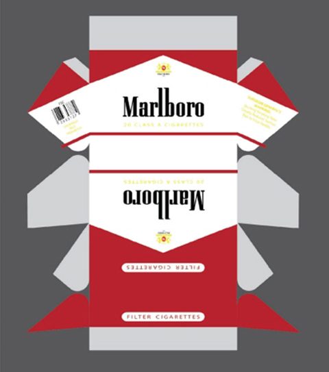
the manufacturing pattern for the diamond carton is more complicated and requires more material.
the diamond carton is an example of packaging which is meant to make your life harder. while this concept would be tough to implement, it is an interesting look at how by ‘breaking the rules’ of design, we could discourage the use of a harmful product… make smoking inconvenient for smokers. by lb
 a visual collective outlet of inspiration
