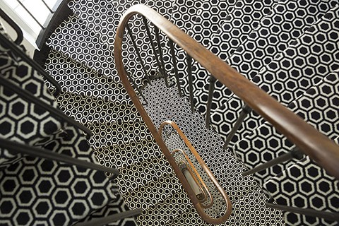
we are swooning over this point of view and great use of geometry of the staircase in hotel de seze, paris. inspiration for the next ts team trip. (source) by kgb
we are swooning over this point of view and great use of geometry of the staircase in hotel de seze, paris. inspiration for the next ts team trip. (source) by kgb
we are sitting here at the ts headquarters in nyc thinking about the kind of winter we have already been greeted with this year; snow and below freezing temperatures. but there is not much beauty to it unless we get play in it. so if you aren’t a blogger and you can get away, we highly advise finding yourself in following situation. oh, and while you’re out there, feel free to send us a thank you email at ts@tomorrowstarted.com.
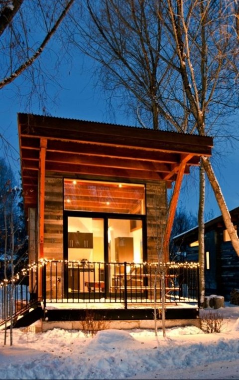
“this is the fireside resort in wilson, wyoming just outside jackson hole and grand teton national park. convenient central location 10 minutes from the slopes at jackson hole mountain resort, less than 15 minutes from jackson and about an hour from yellowstone. super-mod cabins are a contemporary take on the area’s historic homesteader cottages. situated on eight wildlife-filled acres where moose, elk, red-tailed hawks, bald eagles and deer roam and nest, you’d never know fireside resort was a mere seven miles from jackson’s bustling town square. just south of grand teton national park with views of the grand teton mountain range from the property, fireside resort offers the intimacy of a boutique hotel, the atmosphere of a wooded campground and the ambience of a cozy vacation home.
walk into your personal one-bedroom cabin, designed in a modern rustic style, and any ideas of cowboy kitsch disappear. constructed from recycled wyoming snow fence, the sleek structures have gas fireplaces, plush chocolate leather couches and bright contemporary art, all softened by the gnarled exposed wood beams overhead. each comes with a furnished deck, a full kitchen, and a tempurpedic pullout couch (in addition to the comfy king-sized bed in the bedroom). HD flat-screen tvs and rain showers add to the contempo-cozy charm.
there is no restaurant or even a central building; most guests cook in their kitchens or eat in nearby restaurants. but the staff can guide you to the top local pros-in-the-know who will assist you in biking, rafting and fly fishing trips in the summer, or skiing and snowmobiling in the winter. the fireside resort experience is simple: it’s a comfortable, tucked-away haven to relax, rejuvenate and set up headquarters for all your jackson adventures. and while it might be tempting to hole up by the fire in your homey pied-à-terre, yellowstone national park, jackson’s saloon-filled downtown and the world-renowned jackson hole mountain resort are all an easy drive away.” – sam storms for jetsetter.com. by ad

we all miss him, his music, and his looks. by kgb
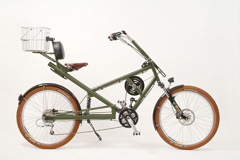
need. spotted on one of our favorite sites/shops, brooksengland.com , this ‘rad’ bike and other similar models are made by ruder-rad of germany. not only do their bikes give you a laid-back experience for cruising, but the mechanisms are pretty killer too. the handle bar can be used in a rowing motion to add power to the bike in tandem with your standard foot peddling motion… and if you don’t want to row, then just sit back and peddle, it’s optional! you’re bound to have a smooth ride due to your laid-back weight bouncing on the supportive spring. the basket on the back and the headlamp mounted on the front wheel are just cherries on top. this model will run you 2999 euros or roughly 3554 us dollars. but how much do us city slickers spend on our monthly unlimited subway cards, taxis, and ubers combined? we think its worth a splurge. snag yours here. (and hey ruder-rad, feel free to wheel one over our way! the ts crew will take turns riding it proudly around nyc). by ar

it has snowed. the city is beautifully cold. and this is how you end today. (photographer unknown) by kgb
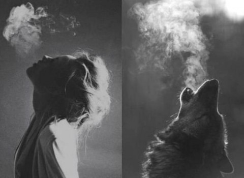
howlin’ for my darling… on a cold and cloudy day by xy

8 bay drobo unit and the 3rd generation drobo 4 bay unit
as you can imagine all this data, material and clips are stored somewhere. that somewhere was a drobo. we’ve been huge fans of drobo from day one. our current 3rd generation drobos served us well for years, and it was a genius solution. they allowed easy upgrades on drives and gave us dual protection we desperately needed with their proprietary RAID software. everyone we knew in the fashion and creative industry used them and swore by them. what we all didn’t know was the nightmare that was awaiting us.
i remember the day we bought our first of 3 drobo’s we now have, i asked the salesperson, “so you guys will continue to be around for some time, right?” i was concerned from day one that this proprietary RAID software could become an issue, simply because its proprietary. for those of you who don’t understand what that means, here it is, the layman’s version:
your drives can be read by your drobo, but once removed from the drobo they become expensive bricks, and your data is forever unreadable. unlike other drives were your data is simply accessible by any enclosure, with your drobo only drobo software can read the data. this is fine as long as drobo stays current with Mac and PC OS updates and continues to solve issues. it’s a problem if they don’t. they kept it running smoothly for years but apparently no more. calls, emails to drobo support have left us with no solution.
were not sure if drobo was originally the brainchild of some wiz who built this great brand, and sold it or left and now the current company couldn’t give a toss about its products that they’ve sold to us all, but its simply a horrible outcome. this is not some tech gadget you can throw away. your life’s work resides here and if you care about your data you should seriously reconsider where you’re going to store it off of the drobo.
drobo known problems and issues: (and you can google this and read others who are pulling their hair out now) – here’s what happened. your drobo icon on your desktop suddenly “greys” out or ghosts. in a few weeks the drobo icon disappears, gone missing from the desktop. drobo simply doesn’t mount. we managed to tap into the data by jerry-rigging it and could see it in apples disc utility but you could not get it to mount. now don’t bother telling drobo about the issues. a) they say they never heard of this and are not aware of it, meaning its an isolated case and b) even when we explained the issue and forwarded them the links to others having the same problem they could not give a damn. we’ve spent over 7 weeks trying to address this with drobo management and since no one but drobo can access the software code or understand it we have no other means to remedy the problem.
the initial calls to support resulted in nothing and we were eventually passed on to higher support via email ticketing.
drobo: “i know this may sound silly but on a new install of a Mac OSX the the connected server drives are hidden until re-enabled through the finder prefs.” we responded by: “yes, naturally this is checked as “on/ active’ in finder”
8 days later pass-the-buck and delay tactics:
drobo: “sorry for the delay. you are not connected to both firewire and Iscsi ? the drobo can only be connected with one option only. how is your IP managed DHCP or static ? whats the subnet mask ? can you tell me the version of your java?” we responded with: “connection: -we are only connected with firewire. IP: – we do not have a static ip for our internet, if that is what you are asking. but i can’t see how this relates to drobo, if the drobo have an ip, please let us know how to check. subnet mask: – we have googled this, but not sure how to find this out, please let us know what to check for and we will do so. java:- we have java 7 update 45”
no response to the above answers that we gave, they then asked us to switch firewire to usb and restart drobo even though we explained that we had our IT on the case and all standard tests were done. then it took them another week in between emails to respond. we had to send an email a week after asking what happened. finally they sent us this response:
drobo: “have you attempted to start from scratch (erase your data) and reconfigure your drop or at least revisit the steps? i would skim through the online users guide to match up screens” (they gave us a link to the drobo manual!!!!! unbelievable)”
getting nowhere with their uninterested staff and delayed tactics, we finally called drobo back via phone. we explained that the physical unit is in perfect condition and that there is clearly an issue now with the OSX updates and drobo proprietary software. we inquired if they were going to update the dashboard software and/or firmware any time soon? and if so in how long? we obviously cant wait for months with this problem… the gentleman told us that as of “yesterday” (i guess they finally realized the problem is wide), drobo will no longer issue updates for this unit and they recommended that we just buy a new one… which of course they will no longer support at some point! really great strategy guys, especially the “as of yesterday we no longer support your unit” line. we will surely spend our next hard earned $1,000+ on your product!!! really disappointing for a company that was so welcomed in our community. we’ve given up on drobo and will be on the search for a simpler system/enclosure. by ts

some winter inspiration from PP’s alter ego monsieur alain delon. by uh
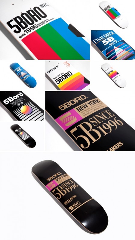 taking it back to the 80’s with 5 boro’s new VHS deck series. each deck is designed referencing classic blank VHS tape sleeves we all used to film shit on. they did a killer job in retrofitting the 5 boros name into sony, NYC into VHS and so on. you can tell a designer with an eye for detail was involved. this gives supreme skateboards artist series a run for their money. well done boys. worth the work… buy some now. by xy
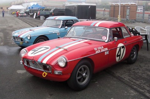
two of the three original MGBs that won the sebring race
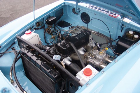
special tuning engine – modified
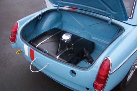
to reduce fueling stops, the MGs were fitted with dual special tuning gas tanks with quick-release le mans-style fuel fillers
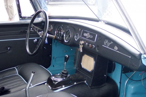
the interiors of the cars were very close to stock in appearance, using the original seats, complete with contrasting piping to match the body color
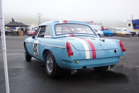
automobile racing was an important part of every automobile company’s marketing program in the ’50s and ’60s. having just introduced its new MGB sports car to the important U.S. market, in the fall of 1962, british motor corporation’s factory team entered two MGBs in the 12 hour florida International grand prix of endurance at sebring in early 1963. what is surprising is that not only that the little MGB achieved success in the race in 1964, but that two of the three original MGBs still survive, and have just been restored to the exact specifications in which they raced that year. if you are an MG fan you are probably familiar with these little devils, and if not you should surely check the history out. lovely little cars to zoom about town. by dd
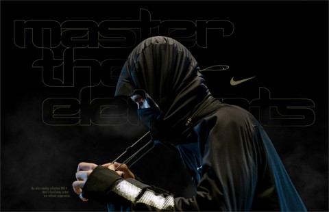
win in any condition: men’s shield max jacket
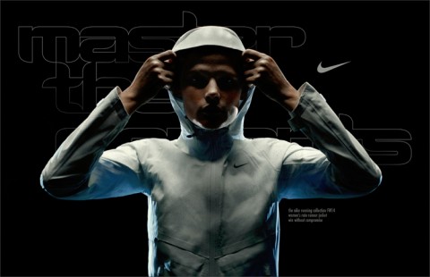
women’s rain runner jacket
killer video and music from nike for some winter time running. suddenly it’s not so cold out there, is it? all you need is an extended version of the track on this clip and you’ll be running for hours. filmed by fashion photographers santiago and mauricio the film is the brain child of new york agency ceft and company.
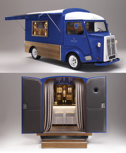
we came across one of the finest bars…and it is on wheels. it is the grey goose pop-up bar, currently cruising the streets of edinburgh, scotland. created by interior designer shayne brady, the truck also serves up breads made by pastry chef christophe michalak.
the ts crew is obviously heading to scotland, see ya! for those of you who will not be crossing the atlantic just to get drunk, just go ahead and try out one of greygoose’s signature cocktails. we suggest the one featured in this post. enjoy and drink responsibly. by kgb
the GREY GOOSE® le citron snowfall martini:
GREY GOOSE® Le Citron 1 ½ Parts
MARTINI® Bianco Vermouth ¾ Part
Fresh Lemon Juice ¾ Part
Honey Syrup (equal parts honey & hot water) ½ Part