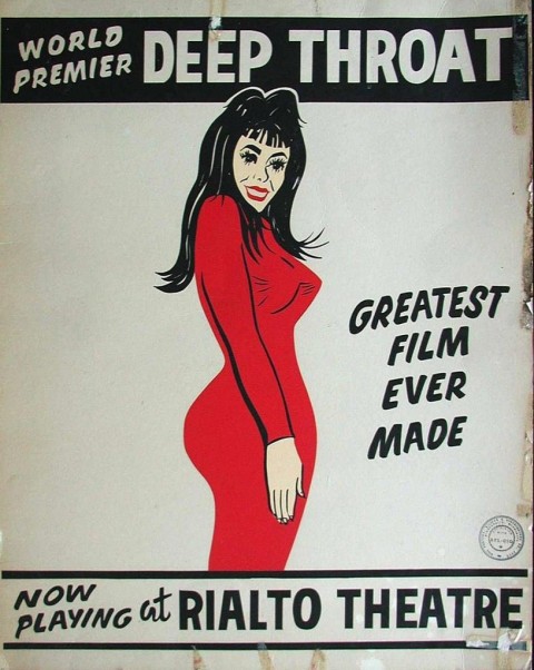
i wonder if nk will agree with me on this choice after he already declared the greatest woman earlier this week. a vintage poster that has served as inspiration for pop videos (oops, they did it again, and again…) and funhouse vaudevillian debauchery for years to come, thank you linda lovelace. by sv
Author: tomorrow started
wirra willa
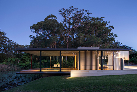
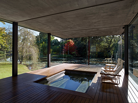
a design by matthew woodward architecture in somersby, australia.
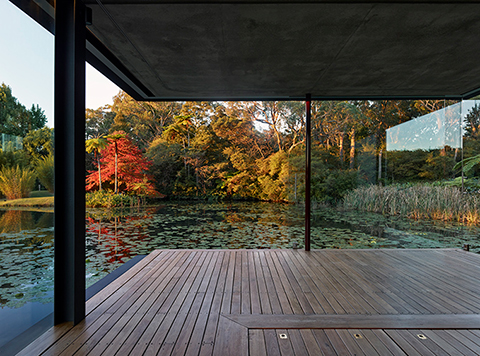
the wirra willa pavilion is a miesian-inspired glass pavilion situated in a vibrant and fertile, rural landscape setting not dissimilar to that seen in a claude monet painting.
the aim was to create a multifunctional space that provided an experiential opportunity for the visitor so they could appreciate, to the full extent, the inherent beauty of the landscape. the specific site is situated remotely on a private property that totals 80 acres and was originally established as a stone and citrus fruit orchard. there are well established gardens intertwined throughout.
the pavilion cantilevers over the natural spring fed dam to connect the inhabitant to a sublime environment that is pulsing with an abundance of life and natural beauty. it is essentially used as a private and remote spa house and guest retreat that compliments the existing residence on the property.
simplicity is essential to the success of the project. the approach was to maintain simplicity through each stage of the design process in order to create an elegant, unobtrusive incision into the landscape setting that allows for both prospect and refuge.
the use of the pavilion is multifunctional. the design needed to be flexible and adaptable to accommodate for various uses during the changing seasons throughout the year.
site selection was critical from a sustainability perspective; the location was selected for its remoteness, opportunity for prospect, and orientation to the sun and prevailing winds.
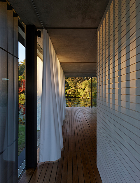
the orientation of the pavilion in the northeast captures the sun and responds to prevailing winds. in the warmer summer months, the sliding glass panels can open up to allow for natural cross ventilation by inviting the prevailing breezes, while in the cooler winter, thermal mass of materials conduct heat from the sun to allow for a relatively constant internal climate.
the materiality was selected for the inherent tellurian characteristics to harmonize the building to the natural setting. the geometry itself is simple; the building is essentially two bisecting rectangular prisms, one created from composite steel, concrete and glass, and the other a sandstone cladded core. the structural solution was derived from a rationalized ‘grid’ system.
it is a special place that one can escape to find peace and solitude.
(source: contemporist) by kgb
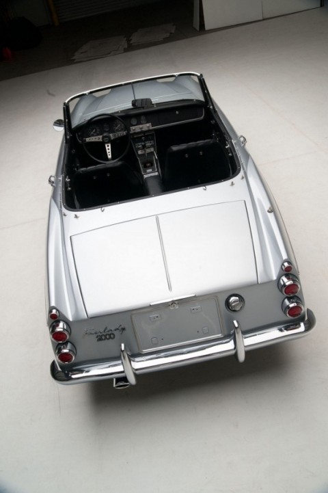
japan tokyo sports coup: 1967 datsun fairlady convertible
above the 1967 datsun (yes, datsun) fairlady sports 2000
if you can forgive its lame name (fairlady?) that, perhaps, was lost in translation, this was japan’s lovely little answer to the jaguar xj6 and ferrari spyders of the time. it was an inexpensive alternative to the MG, triumph, fiat and the alfa romeos of europe. to me, and enzo will strangle me for this, it was always the baby sister to the ferrari 250GT SWB california spider; the resemblances are uncanny (below with scaglietti coach works). either way, this was one marvelous looking car despite its price. here’s japan vs. the italians, and in this case they both won big. too bad the recent models are so uninspiring… and yes, the datsun’s too. this beauty was on ebay at some point and the “buy it now” price was US$35,000 while the highest bid at the time it was documented was US$18,100. who knows what it actually sold for but either way, what a steal… by dd
below the ferrari 250GT SWB california spyder (scaglietti)
the greatest woman
“once i wanted to be…the greatest” – so craves our reckless beauty chan marshal.
by nk
cuba: memories of underdevelopment
massively personal and poetic film. based on a book by edmundo desnoes and directed in 1968 by tomás gutiérrez alea (IMDB) during the turmoil of social change in cuba. it is unfortunately his one and only good film, but how many can you do in a lifetime anyway? don’t ask why the titles are in japanese… by dd
wish you were here
this is absolutely one of our favorite album covers. one man on fire, the other not–floyd’s idea that you can be burned at any given moment, so you should conceal your real feelings. a little known fact, the burning man IS actually on fire; before the shoot, he prepped by wearing an asbestos suit and a wig, then dousing himself with gasoline and lighting a match. certainly going to lengths for a good reason, any pink floyd fan would agree. the cover was designed by hipgnosis, the english art design group who specialized in rock albums. by nk + sv
written on the wind
all this talk about films and we haven’t said a word about the recent passing of perhaps the last surviving old hollywood starlet, lauren bacall. known to her friends as betty, ms. bacall’s career spanned decades. a tough, no-nonsense, downright lady with that immersing, smoky voice and carnal gaze. going through the archives, i finally watched written on the wind, douglas sirk’s film starring bacall and rock hudson, the satirically pleasing look at big business and the destructive families oftentimes behind them. the film is playing at the museum of the moving image’s see it big!: hollywood melodrama series tonight, if you’re in the new york city area. if not, you can read more about it here. by sv
quote of the day
“day by day and night by night we were together,—all else has long been forgotten by me…”
-walt whitman, once I pass’d through a populous city, leaves of grass
taking it back to 1963
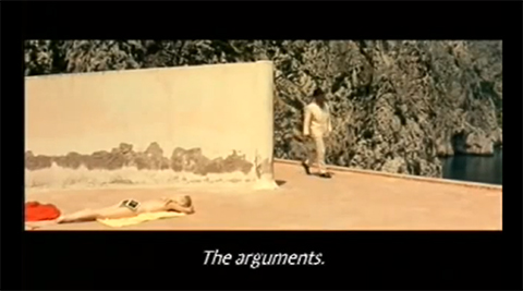
if you have not seen casa malaparte before, make sure to check out this previous post about the amazing house. the building is featured in the godard movie le mépris with an equally amazing trailer.by kt
Patrice Chéreau: flesh of the orchid featuring charlotte rampling
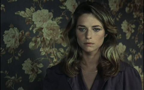
charlotte rampling in flesh of the orchid… sorry about the below, it was the only clip i could find of the film online, but it should convince the boys…
night porter with charlotte rampling
everyone knows about night porter, but not everyone knows about the flesh of the orchid. both are great films, featuring charlotte rampling at her best. mark them down for this weekend’s movie night if you can dig them up. flesh of the orchid is a 1975 film by director patrice chéreau based on an adaptation of the 1948 novel of the same name by mystery writer james hadley chase. not bad for a first film, not at all… by dd
morbid anatomy
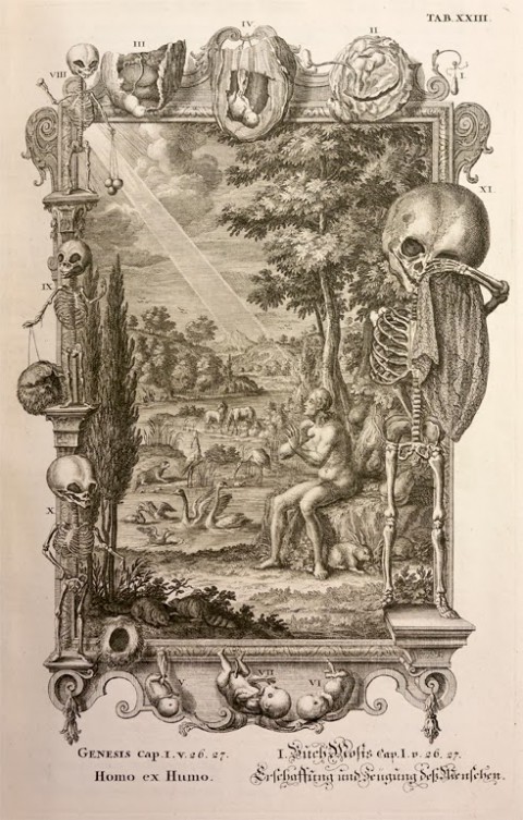
the morbid anatomy museum is finally complete, happily residing in their new headquarters in gowanus, brooklyn. i have attended two lectures there so far, both by the knowledgeable and charming dr. john troyer of the university of bath. the first lecture focused on the environmental issue of corpses; basically if their organic biomass is hazardous or helpful. the second dealt with the necrophilia laws in the united states, a case in wisconsin in particular, and other death-related errs in our country’s jurisprudence. nearly every night there is a fascinating lecture in the museum’s basement, and of course, the museum is open during the day as well to satisfy your skeletal cravings. the above photo is called homo ex humo (man from the dust) and can be found on the museum’s website. by sv
i want to go to there
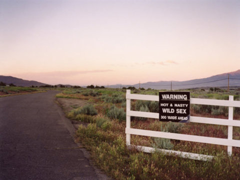
it is funny, but i hope it’s true. i might try to go to this ranch/farm this weekend if i can find out where it is. what they say is 200 feet ahead is much needed. by pl
 a visual collective outlet of inspiration