good wood: artist jorge pardo’s wooden table

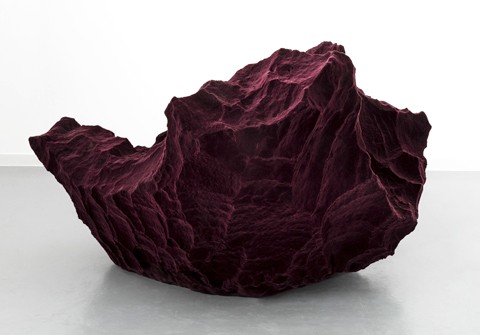
cuban american artist jorge pardo

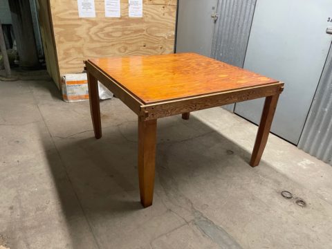
early example of artists object – wooden table

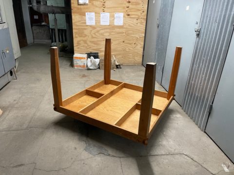
beautiful under structure

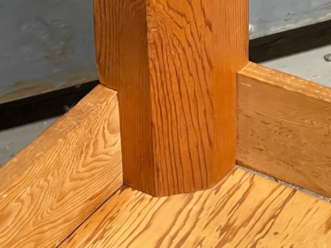
tapered legs and beautiful joinery

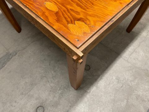
laminated particle board with knots – corner joints

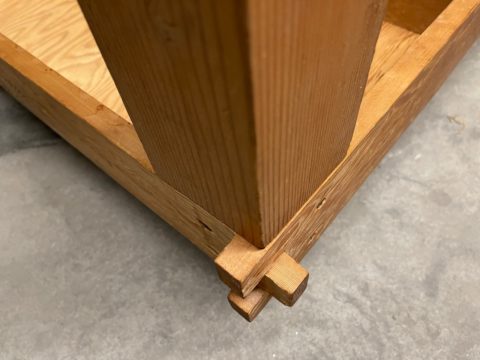
an early example of a wooden art object by cuban american artists jorge pardo, prepresented by friedrich petzel gallery in new york. its a beautifully designed table, with details on the joints, the curved legs, the floating top, and the under structure but made of disposable laminated particle board (aka bad wood) often used to obscure construction sites.

each of the tables 4 legs are finished with a different brand of varnish, purchased from a variety of targeted stores, such as in an art store, a hardware store, bulk store and so on. all of them are the same but marketed to different people… and therefore priced rather differently – while the ingredients remain the same. the table is a table intended for a sort of a discussion about the state of our world and its manipulation of its subjects. of course don’t ask the cuban artists to explain his work, he will laugh you out of the room. by uh

moncler rocks the samurai train and we love it!

love the new moncler designs by london-based menswear designer craig green

a nod to the frenchies… the michelin man would be proud of mister green

samurais looked cool in japan – people who try to look-like samurais in aspen, a whole ‘norther story!

skepta drinking his cool-aid : no… you don’t look cool dude, you look ridiculous

again not that these are intended to be worn, although no doubt kanye and his fans will, there’s also those who wear pineapples on their heads, or anything that is obnoxious, attention is on the decline, but this exercise in shape and proportion is simply a breath of fresh air for us. they make us love moncler for their bravery… and that alone is worth every penny they spent…

drooooool…

asymmetric anyone?

love these silhouettes – Hattori Hanzō

invincible in the tube

sculptural

and there’s always a variation of the label to insure your money is well spent…

maison martin margiela label

the label is very margiela-knock but that’s ok, you can copy legends. we did it too. well done moncler for the statement, love the trickle down variation also on ssense.com and congrats to you on having a silly market that will wear anything you dish out as long as its reassuringly expensive – its called desperation by uh

when in london…

untitled XIX, 2015, 1 of 16 from “a lexicon of paisley” – by leonora hamill: mixed media collage, printed matter and jacquard fabric, 25 x 31 cm, unique

love the series by our artist/photographer friend leonora hamill, currently on display in london at the podbielski contemporary. “a lexicon of paisley” is a series of twenty-six collages that constitute a visual index of the paisley motif. the works return to the persian origins of the motif called botehwhich encapsulates a variety of botanical forms. against a backdrop spanning the british industrial revolution, the napoleonic era and the summer of love, the series pays homage to paisley fabrication techniques as well as to early photographic processes. it evokes the simultaneous conflict and symbiosis between east and west, past and present, and craftsmanship and manufacturing processes. podbielski contemporary somerset house, strand, london WC2R 1LA. if you are there check it out. by uh

marcel dzama at the new york city ballet

marcel dzama ballet 3

marcel dzama ballet ballet 2

marcel dzama ballet ballet

very excited to attend the “the most incredible thing” at the new york city ballet this saturday that features scenography and costumes by the artist marcel dzama. if you dont know the artist make sure to look up his work and check out the short feature above. by kt

Nameless paints

nameless-paint-tubes-primary-colors-ima-moteki-3

nameless-paint-tubes-primary-colors-ima-moteki-5

nameless-paint-tubes-primary-colors-ima-moteki-1

nameless-paint-tubes-primary-colors-ima-moteki-4

nameless-paint-tubes-primary-colors-ima-moteki-2

ima moteki, a design duo in japan, has just created a set of nameless paints that aim to completely change the way children learn and think about color. instead of using color names, each white tube of paint is labelled with an “equation” showing which primary colors, and in what proportions, were used to make the color inside.

the designers, yusuke imai and ayami moteki, believe that color labels are problematic. “by not assigning names to the colors we want to expand the definition of what a color can be, and the various shades they can create by mixing them,” said imai.

in addition to rejecting labels, the paints also teach color theory. the equations on the paint tubes help children understand some of the basic concepts behind color theory and how to mix and create new colors. by lb