did you ever wondered what paper the studious boys used to light up a spliff?


photo credit roger mayne post war street photography

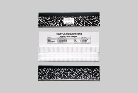
here’s how to roll a joint : now we don’t smoke no more “cuz we wizzzed-up and shit”, but… if we were to light up a joint one one day, we’d be sure to grab our composition notebook to roll that spliff. noy suggesting smoking vus smoking kills – and yah a joint here, a joint there is cool, but just know that no matter how bad ass you are now, it’ll creep up on you. hear that from the mother-load of bad asses. by cc

HIFI review magazine: original opinions on the Bose 901 back in 1968

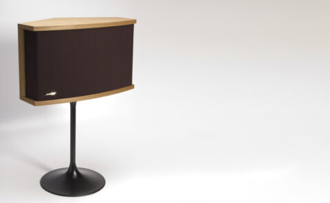
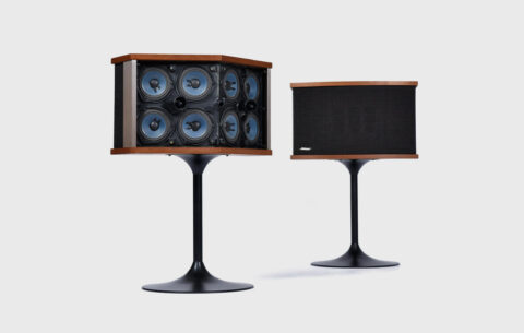
original bose 901s – not the greatest audiophile sound for the money, but surely interesting to look at with its horizontal approach and beautiful cabinetry.

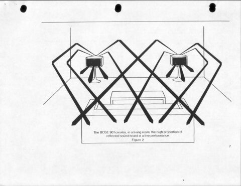
in the light of the new hyped-up kith + bose collab reissues of this classic speaker we thought we’d share a bit of its history, as i myself once considered buying a pair, almost a decade ago, but instead opted for a pair of magnepans instead… but here it is non-the-less… “there may be no singular product in modern audio history that has generated more accolades, derision, or pure controversy than the bose 901 loudspeaker. introduced in 1968 by a then four-year-old concern named after its MIT-educated founder, the 901 neither looked, nor sounded, like any speaker that had come before it. with its pentagonal cabinet that faced eight of its nine identical 4-inch, full-range drivers at the reflecting wall behind the speaker, its designer amar bose sought to have it mimic the way we hear in concert halls and imbue its sound with a giant soundstage and spatial realism that was unsurpassed.

amar bose and his 901’s in a clear cabinet

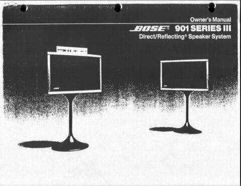
copy of bose 901 series III owners manual

beyond any success of its spatial trickery, the 901 had its issues — the combination of its small cabinet and unusual dispersion pattern required equalization at both ends of the frequency spectrum, and it was (not surprisingly) room and placement sensitive. some sophisticated audiophiles bemoaned a perceived lack of detail and veiled quality to its sound. j. gordon holt, founding editor of our high-end sister publication stereophile, noted in a 1971 commentary that the 901 “produces a more realistic semblance of natural ambience than any other speaker system, but we would characterize it as unexceptional in all other respects.” my own mentor, harry pearson, jr., told me in the early 1980s that he bought a pair of first-generation 901s after reading the positive reviews in the mainstream audio press and was so disappointed that it prompted him to found the absolute sound as an alternative voice.

you are looking at he BACK of the speaker here

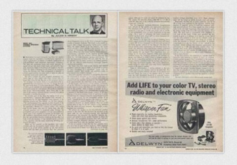
in the legend and mythology of the bose 901, the review we’ve reprinted here, written by julian hirsch for hifi stereo review’s september 1968 issue, looms large. it has been suggested by some observers that few factors beyond bose’s own advertising contributed more to the speaker’s huge commercial success. while the review retained hirsch’s usual dispassionate and professorial voice, it was certainly as close to a rave as he ever got. in 1998, when sr celebrated its 40th anniversary and hirsch was asked to reflect on the most noteworthy products he’d encountered, he cited the 901 right alongside such classics as the original shure v15 cartridge, the marantz 10b tuner, and the dynaco a-25 bookshelf speaker. back in ’68, the 901 review appeared without fanfare and was mixed among the several featured each issue in hirsch’s “technical talk” department, which always began with a brief essay (not reproduced here), followed up by a handful of product tests.”

above sound dispersion and positioning – positioning the 901s, which fire backwards, in a standard room can be challenging as the 12-inch gap necessary between the apex of the speaker and the wall places the front of the speaker about 30 inches from the wall. you need to be sure to have a room that can accommodate that. over all a great consumer level speaker system, with some proper positioning and staging however in my opinion “too much electronics” to make this a true pure sound audiophile unit

original  hifi stereo review magazine review from 1968

“depending on one’s viewpoint, the bose 901 speaker system might be considered a revolutionary approach to sound reproduction, or simply a workable combination of well-established (and sometimes deprecated) techniques. the bose 901 enclosures house nine small, specially designed drivers that have 4-inch cones and powerful magnetic structures. eight of the drivers are angled to the rear, while the ninth is mounted on the front of the enclosure facing the listening area. this arrangement is intended to achieve approximately the same ratio of direct to reflected sound that exists in the concert hall…” to see the rest of the review by julian hirsch, in the 1968 issue of hifi stereo review magazine, click on the link. by ss

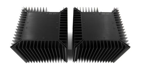
monoblock or monolith: the massive pass labs aleph II monoblock amplifier

so iconic – the only thing it can be compared to is the monolith

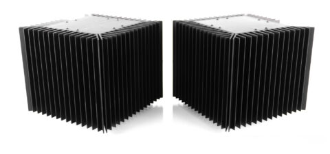
circa 1997 – these are perhaps one of the top 10 best solid state mosfet amps money can buy – they are just under 12″x12″x11″ and weigh just under 60lbs each. each monoblock is rated for a power output of 100W into 8 ohms and 200W into 4 ohms, surely enough for any domestic use. amazing sounding as nelson pass said “one of my favorite sounds i’ve ever made”.

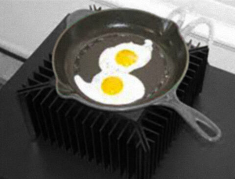
the steel heat sinks on all four sides of each amp disperse the incredible heat – as these babies run very hot!! you literally can fry an egg on top after a few hours of listening. that is not an exaggeration.

pass aleph IIs are absolutely neutral, no coloration can be perceived. the sound is full, round, stable, and deep. the bass is very good, maybe promoting articulation and detail… almost a to a raw violence, but for my tastes i cannot imagine anything better. it has neutrality, or should i say naturality, and precision… you are led to forget about the amplifier, to undervalue it, but as soon as you listen back to another one, you realize how superior this one really is…

beautiful from any angle

effectively, i feel it’s pretty strange to see such characteristics married to a sonority that, while being vaguely tube-like, has mostly a heritage of the positive aspects of solid state, plus that little something, so difficult to articulate, that always distinguish a solid state gear from a valved one – i’d be tempted to call it grain, but i’d be wrong, because we can’t hear any grain here, and the sound watermark is perfect… even female voices are rendered with excellent homogeneity and flow, that can be compared to those coming from a tube gear – yet, distinct from it, in some ways. maybe the definitive difference is in the control and the precision, both better than what can be found in the classic tube world.


pass laboratories aleph II monoblock amplifier owners manual
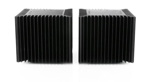
almost 60 pounds (27kg) each – the front view of the aleph II mono block

don’t even think of trying to lift these amps without some thick gloves and at least one burly friend. there’s no way to avoid gripping the heatsink fins, which feel like dull knives on bare flesh. at 130 lbs each, these are certainly not “one-person” amps.

balanced outputs + 5 way binding post – back of the aleph II mono block

i love these amps and i will probably keep them to the day i die and then pass it one to another care taker. thank you nelson for creating these beautiful monsters. by uh

the story of MSCHF with gabe whaley : from west point to buzz feed

meet mschfs original founder and chief geek officer, mister gabe whaley

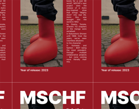
mschf is an art collective / media company / viral for hire agency and very successful at it… of course you must know about the big red boots

we reckon the big red boots was genuine art project which them lead to the collab. with crocs that generated commercial income.

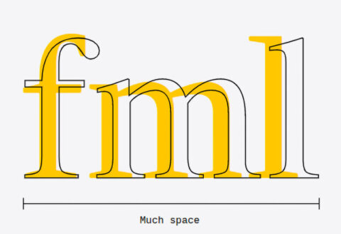
times new NEW roman

one of their earlier projects and our favorite one is the type design project to create “times new NEW roman” which is the same as times new roman but 10% wider. so when you write your college essay your 8 pages will result in 10 pages. nice cheat!!

turbo tax but more fun. tax heaven 3000 was a spoof tax software designed by mschf where the anime girl will walk you through questions, some quite personal, such as your social security number and in the end help you calculate your taxes. about 200 were created. genuine art project.

this “nike, drop of blood in the sole, lil nas satan shoe” project was the first time we ever heard about mschf… back then it smelled like marketing and we paid little heed… but was it marketing?

vans shoes sues mschf for its wavy baby sneakers. not really buying this lawsuit – but we guess you gotta keep the magic under lock and key for it to work.

mschf founder gabe whaley & the art of going viral | EP 33 by business untitled

and here’s an interview with mister gabe whaley himself, telling his sweet story to success from west point to buzz feed. well done gabe!! you are a commercial version of tobias wong whom we loved (RIP)… but you are a 100% better than daniel arsham (reddit)who occupies a similar space. by sv

Website of the Day | Donald Judd Library


some incredible work by the folks over at chips, friends to the south all the way in brooklyn (shudder). knocked it out of the park with this website. a quick tour through it, made available by the agency, can be viewed here, above.


digital floorplan

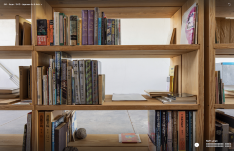
a bookcase for ‘japan’


detail view of that bookcase


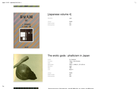
every single book is listed, has its own data sheet, and is linked on WorldCat to find at your nearest library.


the donald judd foundation put this together, judd’s library is a space rebuilt all over in the desert and now available to us all online. i cannot overemphasize how priceless this work they’ve done is. truly a place to get lost.

here is the website – judd foundation – library – please, please, enjoy! by lsd

genius of fashion…

it takes wits, guts, arrogance, lack of management and a good dose of stupidity to pull this off. but don’t worry, we have the talent, and the means. few things come to mind here, i recall when hedi slimane took out the yves from saint laurent. ego? perhaps? after all balenciaga did not have its founders first name in the brand, so why should saint laurent? not like fashion has to follow any precedents now… but to change that beautiful and iconic logo to such a lame, ubiquitous, poorly spaced, infantile typography was surely hard to digest. not that the rest of the fashion crowd just followed hedi right? fashion never repeats, “we don’t look back darling, we don’t follow… we lead the world into the future”. well here they are, following hedi right off the edge of the cliff into the grand stupid canyon.    by cl

moncler rocks the samurai train and we love it!

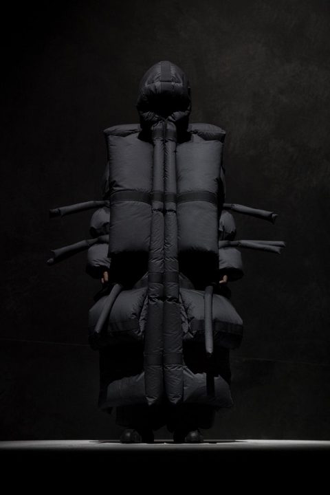
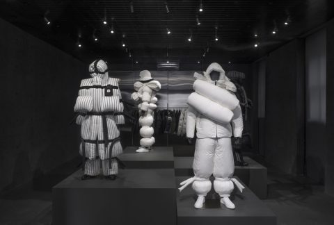
love the new moncler designs by london-based menswear designer craig green

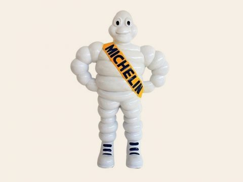
a nod to the frenchies… the michelin man would be proud of mister green

samurais looked cool in japan – people who try to look-like samurais in aspen, a whole ‘norther story!

skepta drinking his cool-aid : no… you don’t look cool dude, you look ridiculous

again not that these are intended to be worn, although no doubt kanye and his fans will, there’s also those who wear pineapples on their heads, or anything that is obnoxious, attention is on the decline, but this exercise in shape and proportion is simply a breath of fresh air for us. they make us love moncler for their bravery… and that alone is worth every penny they spent…

drooooool…

asymmetric anyone?

love these silhouettes – Hattori Hanzō

invincible in the tube

sculptural

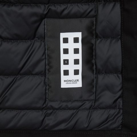
and there’s always a variation of the label to insure your money is well spent…

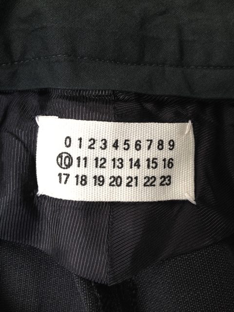
maison martin margiela label

the label is very margiela-knock but that’s ok, you can copy legends. we did it too. well done moncler for the statement, love the trickle down variation also on ssense.com and congrats to you on having a silly market that will wear anything you dish out as long as its reassuringly expensive – its called desperation by uh

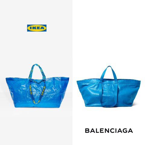
balenciaga vs. ikea

ikea/balenciaga homage. its a gas… but two thumbs up to those who “bite the hand that feeds them”. its pretty punk of demna gvasalia especially for a georgian who studied in antwerp! this is a TOTAL fuck you to all rich people. and we love it for that idea, but no clue if that is indeed even close to what demna had in mind? more like something from tobias wong R.I.P!!!  by xy

boom and your in london in 3.5 hrs

concord-supersonic-passenger-jet-boom

the new supersonic jet to replace the concord for the same price as today’s business class.

meet boom. boom is a prototype for a new supersonic passenger airplane that will be able to fly new york to london in just 3.5 hours, slightly quicker than concorde used to. but here’s the best part, boom states that it is using existing technologies to keep costs low, and the business model is based on flights being about the same price as a current business class is today, that is approx $2500 each way. apparently boom is already in development and test flights are planned for late 2017. fasten your seat belts, were coming to london for dinner. read more about boom supersonic jets here. by ac

design to annoy

marlboro-cigerette-packaging-bad-design1

a theoretical look at designing inefficient packaging. a project i found online by erik askin that deals with designing “bad” packaging to make smoking more annoying.

what if to discourage smoking, cigarette cartons were designed to be less convenient? in 1940 raymond leowy re-designed the packaging and logo for lucky strike cigarettes revitalizing the brand and bringing great success to the company. the standard flip-top cigarette box is an excellent design. in terms of presentation, accessibility, and branding, a pack of cigarettes is fantastic. currently, cigarette companies are required to put warnings on their packages about the dangers of smoking. what if we took it a step further?

first, what makes the cigarette carton such a good idea? 1) convenience. cartons allow smokers to easily access and store cigarettes, and the design is easy to manufacture. 2) branding. the logo orientation and point of purchase display provides excellent brand advertising and turns the area behind the register into a huge billboard. 3) portability. cartons fill well into our daily lives by accommodating items such as wallets and cell phones, and fit easily into our pockets.

within reason, how impractical can we make cigarette cartons?

marlboro-cigerette-packaging-bad-design2

marlboro-cigerette-packaging-bad-design4

marlboro-cigerette-packaging-bad-design0

marlboro-cigerette-packaging-bad-design5

marlboro-cigerette-packaging-bad-design7

by testing out different orientations, sizes, and flip tops, the least-ergonomic and least efficient design within reason was discovered…

marlboro-cigerette-packaging-bad-design4 (1)

“the diamond carton”

by addressing issues such as accessibility, portability, branding, and manufacturing, the diamond carton makes life subtly harder for smokers.

marlboro-cigerette-packaging-bad-design3

marlboro-cigerette-packaging-bad-design3 (1)

the box’s physical orientation makes it hard to display the logo and brand.

marlboro-cigerette-packaging-bad-design6

the orientation and taper of the carton, makes access and sharing difficult (some might say that is a positive thing).

marlboro-cigerette-packaging-bad-design1 (1)

the multi-faceted sides fit poorly in the pocket.

marlboro-cigerette-packaging-bad-design8

the point of purchase, the carton is oriented in such a way that brand advertising is minimized.

marlboro-cigarette-packaging

the manufacturing pattern for the diamond carton is more complicated and requires more material.

marlboro-cigerette-packaging-bad-design9

the diamond carton is an example of packaging which is meant to make your life harder. while this concept would be tough to implement, it is an interesting look at how by ‘breaking the rules’ of design, we could discourage the use of a harmful product… make smoking inconvenient for smokers. by lb