really don’t know where this feeling came from but i’m totally obsessed with the eames dowell chair. i guess it’s a designer kind of obsession as noone around me seams to relate except other designers. whatever, considering that buying an original is not even an option, I wonder which version of the new releases are the bests ones?
herman miller of course is the original manufacturer but they shifted to plastic shell and modernica is the only manufacturer now to built the original fiberglass shell versions. i checked the herman miller version and even if mr eames, as HM states, wanted to use plastic originally but couldn’t at the time, the plastic version still feels a little cheap. so what can one do, since none are “original”? any advice? by pp’
design
Dutch Football Federation 2010 World Cup Shirts
Puma: clever little bag by designer Yves behar
Richard Meier: the Rachofsky house-Dallas Texas

the heart of the house is the second floor living room. secrets of the entire site are revealed through the double-height plane of windows that serve as a permeable membrane between nature and home. whereas the front façade of the house is reserved and opaque, the back façade dissolves and allows constantly changing plays of light and silhouette to amaze people within and outside the house. ultimately, the purpose of the rachofsky house is to provide a place of residence and respite. the potential of the house as a work of architecture is as a catalyst for further contemplation of nature and art, and the science of bringing them together in harmony.” richard meier by dd
what’s behind the logo

chanel cosmetic adverts: malgosia bela photographed by solve sunsbo
for the record, aside the early lancôme campaigns approx 3 years ago, these are some of the most beautiful cosmetic advert ever. polish model malgosia (actually malgorzata) bela photographed by norwegian photographer solve sunsabo. i remember when i first saw one in a publication, it just stunned me. i stopped and had to take notice. it was quietly screaming and making me want something… i’m still wondering what that was. by dd
Prada logo treatment: follow me to hell
so what does a luxury brand like prada do when everyone’s trying to be lux? seeing the latest logo treatments at the parda store made me wonder for a bit… i saw a random half cut logo on the cap of some cosmetic pack, the fragrance box with the double logo on the box, one covering the other… like someone saying their name twice upon introduction. the first name quietly and muffled and the second, bold and pronounced. this of course is a major no no in design, but with fashion in general anything goes, all bets are off. they even make wallpaper patterns out of their logos (i bet that made the marketing directors excited), i cant help but equate such behavior with one of those tacky celeb PR shots infront of some logo plastered wall for some vodka of the day, after all that’s the real purpose, so lets not be shy. but this is not always the case with madam prada. not only the double logo is there for no good reason, they took great pains to design it as thought it was haphazardly placed over the second, or even better, just casually running off the cap. like one of those “i just woke-up” haircuts that took hours to do. but to their credit what else could prada do? whatever prada does is knocked off within weeks, i mean every monkey now has a perfume with one of those ‘squeezable testicles’ that prada reintroduced… maybe this is the latest way to separate yourself and say… ok you wanna follow/copy me? go right ahead… i’m jumping out the window. by dd
Puma: the king kong of ping pong

Gallery: international edition volume 5
 some nice work in the latest issue of gallery
 dzuae tatanako (tokyo), sergey tarasenko, anastasiya litvinenko (russia),
  ceft and company, ucef hanjani, kimberley norcott USA, eduardo del fraile, aurelia gonzalez (spain)
 landor associates, jason little, malin holmstrom (australia), landor associates, jason little, malin holmstrom, james cockerille, nocola dearn, mike stainford, joao peres
dirty
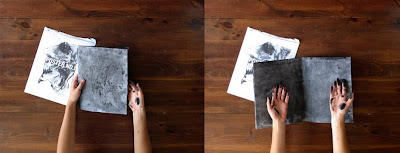
absolutely beautiful piece by brooklyn based designer roland tiangco. sums up everything!
described as follow on his website: “a poster the recipient completes by revealing spot-varnished type with hands made dirty by handling the poster, the back of which is coated with powdered pigment. this is the first of a series of posters.” genius! click on the images to get a better look
by pp’
tankette table by paolo pallucco and mireille rivier

yeh it’s just that kind of a day

turns out of course it has nothing to do with that, it was a phrase, or so i learned, that was refering to technology and how its made us all more miserable… hell, i agree lets bitch about that at least anyway. by uh
 a visual collective outlet of inspiration


