
design
florent – tibor kalman
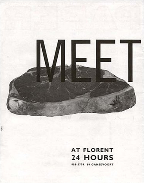
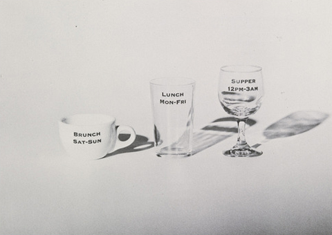

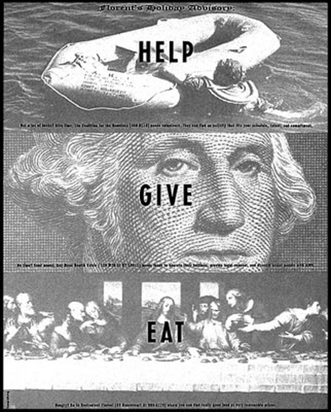

copyrighted
by pp.
Bjørn Blikstad Imeüble
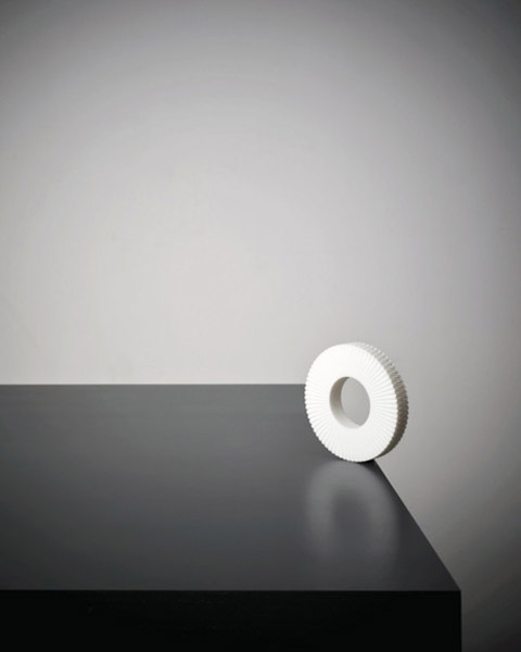
shelf system creating an amazing illusion, something in between 2 and 3-d; described by the designer bjørn blikstad as 2.5-d. by kt
joseph dirand – interview
great interview of french kubrician’s architect joseph dirand. from fvf. by pp.
wanna be an artist?
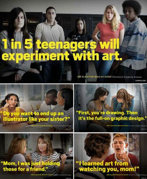
51% of kids wanna grow up and become a rock star, the other 49% go to art school and wanna be in the “creative field”. it’s the easiest cop-out in history, cause it’s “cool” and seems fun and easy enough. the bonus is you can brag to your friends about what you do, and you can finally justify that stupid outfit you’ve been wearing. with all of that who would want to become a scientist? that sounds hard, if not outright boring! until the time comes when you actually have to “be” a real artist, and 98% of that 49% go crying back to their mommies and beg for their boo boo bunnies. the other 1% drift in-and-out of art rehab and the last 1% actually become what they wanted to be. so listen up kids, being an artist sucks. it’s damn hard, it takes commitment, passion and 110% of what you probably don’t have. if perchance you do have all of that, very few ever make any money at it. so basically, go back and study to become a banker, or a business man. your mom and dad will surely be pleased. by ht
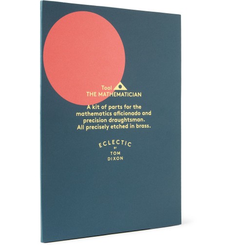
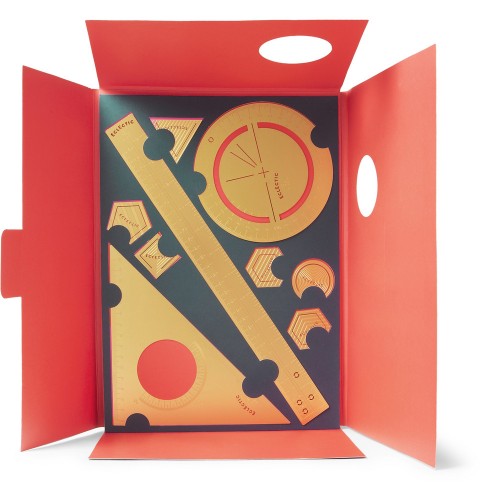
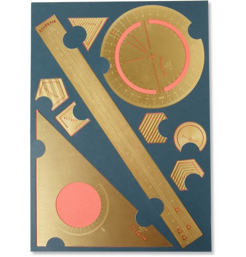
FORGOTTEN TOOLS – DROOG DESIGN

YOY



settle down
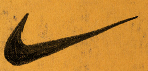
nike original sketch
original sketch of the nike logo by berthold. courtesy of carolyn davidson.
i have always wondered what it looked like…carolyn davidson designed the swoosh in 1971 while she was a graphic design student at portland state university. phil knight, who was teaching an accounting class at the university at the time, stated of the logo: “i don’t love it, but it will grow on me.” well… by nk
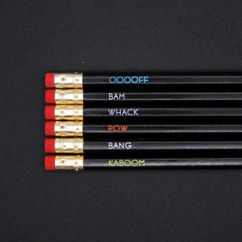
get the lead out
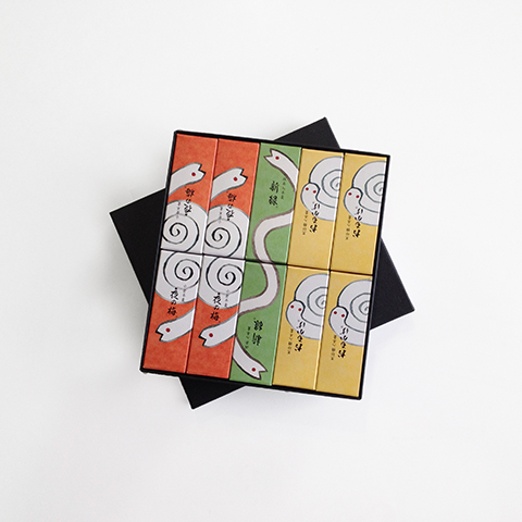
year of the snake
 a visual collective outlet of inspiration
