fashion
if i was…
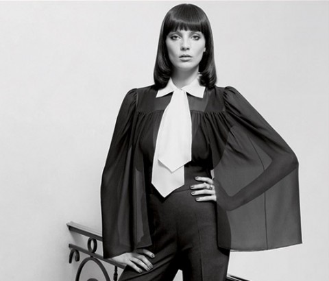
YSL manifesto with Daria Werbowy
must say i hate the usual bullshit brand videos. the typical, glorifying, amateur, behind-the-scenes of kate (at best) swinging her hair in the wind; but, inez and vinoode rocked this one. the locked down camera, dead simplicity, gorgeous silhouettes of stefano pilati, “invisible” track and daria in the best wig hairdo i’ve ever seen. drooooool. almost as hot as the fella kuti video in his trunks. by dd
shang xia – hermes
uber luxury brand hermes rocked the fashion world opening a new brand, it’s a first time for hermes, and none the less, it’s a chinese brand, called shang xia and it’s only sold in shanghai for the moment.
rather surprising but after reading some articles about this strange team, i figure out both brand share a hardcore interest in craftsmanship and tradition. so if any other brand had done the same deal, i would think of them as opportunist but coming from hermes, i’m just really wondering… (read the article, it’s interesting) by pp.
sephen gan – nice!
vanessa bruno – day for night
let us continue with the fashion short movies. in the past, we have posted vanessa bruno’s shorts, and the new one is just as beautiful. pure pleasure. we were talking about ryan mcginley a few posts earlier, but to me those shorts are the best cross over fashion/movies.
it’s from stephanie di giusto and it’s featuring valentine fillol cordier and once again lou doillon. sublime! by pp.
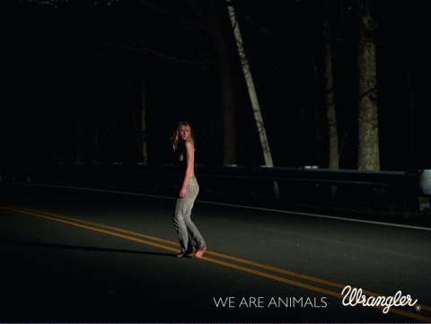
ryan mcginley reminds us – we are animals
Paul rowland at ford
model Iris Strubegger by photographer barnaby roper

thomsen – french style
i’m sorry, it is not because i’m french and somehow chauvinist but really, french brand thomsen actually nailed the plaid/liberty shirt. when every US brands are coming over and over with the same plaid shirt that feel right out of the williamsburg salvation army ( sometime even with a $300 price tag).
those frenchies achieved doing it their own way giving it a nice “cacharel/mai ’68” look rather than a lumberjack feel. on top of that, the campaigns features some of our nicest roosters and the blog is really cool. cocorico! by pp.
edward hopper a go-go


green as envy: supreme management SS2011 show package
the modeling agency supreme management in new york has gone through some major changes recently. under the new direction of caroline poznanski (formerly at ford models and next) they are aiming to carve the new look away from the old guard (genius man, paul rowland see our post on his photographs). to set the tone, they just released their latest show package for the SS2011, under the creative direction of new york agency ceft and company. the cards arrived in a cloth bound white box and double sided extra thick satin ribbon. inside, is a hand full of their best girls well edited and in glorious black and white. quite a shift from their old packages.


 a visual collective outlet of inspiration


