so what does a luxury brand like prada do when everyone’s trying to be lux? seeing the latest logo treatments at the parda store made me wonder for a bit… i saw a random half cut logo on the cap of some cosmetic pack, the fragrance box with the double logo on the box, one covering the other… like someone saying their name twice upon introduction. the first name quietly and muffled and the second, bold and pronounced. this of course is a major no no in design, but with fashion in general anything goes, all bets are off. they even make wallpaper patterns out of their logos (i bet that made the marketing directors excited), i cant help but equate such behavior with one of those tacky celeb PR shots infront of some logo plastered wall for some vodka of the day, after all that’s the real purpose, so lets not be shy. but this is not always the case with madam prada. not only the double logo is there for no good reason, they took great pains to design it as thought it was haphazardly placed over the second, or even better, just casually running off the cap. like one of those “i just woke-up” haircuts that took hours to do. but to their credit what else could prada do? whatever prada does is knocked off within weeks, i mean every monkey now has a perfume with one of those ‘squeezable testicles’ that prada reintroduced… maybe this is the latest way to separate yourself and say… ok you wanna follow/copy me? go right ahead… i’m jumping out the window. by dd
fashion
man is back: freemans sporting club NYC

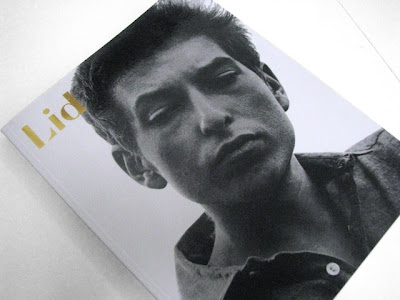
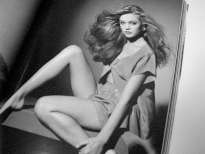
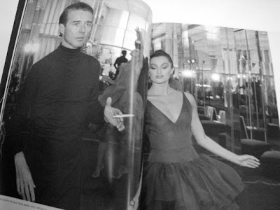
Lid Magazine Number 10-SS 2010: more of a book worth coming back to
 poet, roach killer, artist extraordinaire: mr. jim carroll
martin margiela (untitled)
sometimes not a fan of everything mister fabien baron is coming up with, i was highly disappointed when discovered the bottle for the first martin margiela’s fragrance “untitled”. margiela is definitely the brand i used to consider as the most interesting identity wise so when i saw this ugly green bottle with the stupid white plastic thing around i was chocked… that was until i saw the trailer above that i understood the white thing is paint and it make more sense (still not sure about the color of the juice, the baron choice, dieseland so on but that’s another story)… by pp’
the birth of the cool
for those who are not bored of style blogs or anything that talk about it yet, the man behind the impossible cool launches a conversation on cool which could be seen as a wider version of the previous one. the aesthetic of those two blogs are cool (of course) and today’s post is on mister saint laurent and is illustrated by the great ivan terestchenko abstract portrait of the master. looks good by pp’
self service : stephanie savage
robert longo for brooklyn surfer
“I developed the Brooklyn Surfer logo from a memory I had of being at the beach near Rockaway in Brooklyn. It was late in the day, the sun was bright, hanging low in the sky. As I looked west, down the shoreline into the setting sun, I saw in the distance the sharp silhouettes of surfers holding their boards checking out the surf. This image was burned into my brain. Rockaway is Brooklyn. Brooklyn may sound like an unlikely location for a surf spot, but in reality it is a real location with a decent break and at times some serious swells. It is a unique surfing experience. An extraordinary collision of urban and surf cultures. Not far form the beaches are the basketball black tops of city legends and the subway stations where many of the surfers arrive coming off the trains with their boards heading for the beach and the breaks.” i personally always thought that new york and surfing were kind of an absurd duo but whatever dude. by dd
NEXT ONLINE
after mr. zahm, mr. richardson… it’s time for mr petronio to have his blog, whos next? by pp’
swinger party
africana

Shoof: the shoes natural progression into hoof
Lay off of terry

 a visual collective outlet of inspiration


