
 cire trudon is the worlds oldest candle maker, and is the newest addition of french scent indulgences in new york’s nolita neighborhood. 54 bond street, downstairs, to be exact. with 367 years of heritage, being the candle producer for royalty, and having developed the perfect wax for cleanly sharing their fragrances this may call for a showdown with previously reigning french scent stars at le labo. by kl
perfect gift
a handsome ideology

 something as simple as the perfect little stool can speak of a collage of perspectives (if you want to contradict yourself), but in the spirit of getting back to basics i’ll just say that quality handmade craftsmanship of natural materials, that can last a lifetime is better for you, and me, and them, and mother earth, and your image ;). i can imagine this multi-purpose cuttie aging well. you can pick him up at another country. by kl
perfect gift 1967 chateau-lafite
 1967 chateau-lafite sold in auction for $160, a steel if you are willing to over look the storage record that is. by
the pen is mightier

 brilliant, beautiful and cheap! no, not the ideal woman 😉 it’s the 98% biodegradable pen with non-toxic ink designed by young new york local, leon ransmeier. leon is a part of the design group rich brilliant willing and even though his breakthrough design was with droog in the netherlands he has more of a japanese sensibility than dutch … ‘‘i’m not interested in conceptual one-liners,’’ he says. ‘‘i want there to be a very clear reason behind everything i do.’’ by kl
best made axes – lumbers in tha city


i guess anyone walking to partners and spade, saturday surf shop or any trendy store in the city wondered what the hell is that about to sell axes?!? and i guess i’m not the only one fed up by half the population in nyc fucking around in lumber jack outfits while they never set a foot in any forest but anyway… those axes are really gorgeous. even if i wouldn’t harm a tree for anything in the world, i could really imagine one of these beauty in the corner of my living room. that would be a bit yuppi-ish, aint it? so just for eyes by pp.
hotel labels – lv coffret


saw this box on nice french blog djgm and found it really cool. this is a nice coffret edited by vuitton, there is 30 postcards in there, all die-cute and nicely printed as the old hotels labels from around the world. the box is made out of a re-edition of the 30’s lv print. really calling off a certain era and it’s style. love when fashion brands do things that are not just so irrelevant. by djgm + pp.
le corbusier – his true colors

amazing article by alice rawsthorn in the new york times about le corbusier’s wall colors, must read here, a couple of lines for lazies:
“by 1931, le corbusier had settled on a palette of soft pastels and brights to accentuate white, and arranged for them to be reproduced on wallpaper swatches by the swiss manufacturer salubra. esver the control freak, he specified exactly ho salubra should group the colors together to indicate which ones could be combined.”
…
“a book of all of the swatches made for corbusier by salubra from 1931 to 1959 was published by birkhäuser in 1997. a young chemist, katrin trautwein, the co-founder of kt color, then started to explore the possibility of manufacturing the paints and secured a license to do so from the fondation le corbusier.”
by ar+pp.
williams british handmade luggage


how witty is that? not easy to stack in a trunk but do you really use a car when you carry these luggages? williams british handmade by pp.
say hello to my little friends
 here are the newest additions to jimmyjane, pleasure to the people, by our little yves-eeee. by dd
CÉLINE / simple leather.
 clean, minimal and practical. the search for an good day bag never ends. this is a nice interpretation from the house of celine. $1050 will get you simplicity. by mc
enormous champions tea towels


these hand printed towels by enormous champion (brooklyn, new york) are super cute. got two for my little 4 year old loves. made in the USA on 100% belgian linen. the linens are a lovely shade of natural “oyster”, and silkscreened with a warm grey ink. they look just as good, used as hand towel, or simply framed. $25 each… a bit steep but worth it to me. thanx pp. by xy
ok we just died and went to heaven… in copenhagen: Harley Davidson Sportster

 standard frame ( raked )
 rearshocks
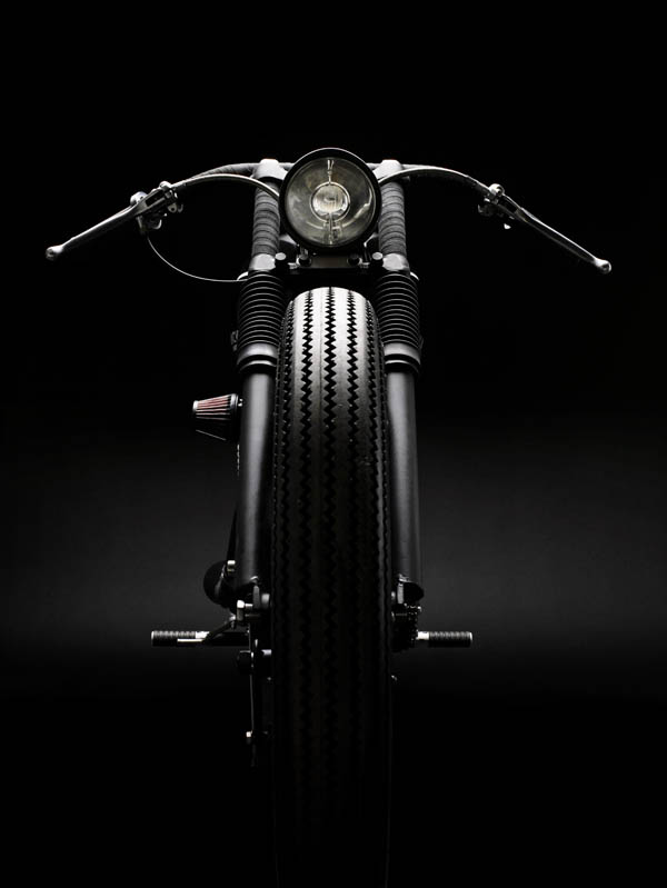 WM handlebar, tarozzi footpegs, 19″ firestone deluxe fronttyre
 WM seat and seatcowl
 front fork
 16″ firestone deluxe reartyre
custom motorcycles copenhagen is featuring a harley davidson sportster: club black #02 featuring standard frame ( raked ), engine, swingarm, rearshocks, front fork, wheels. 16″ firestone deluxe reartyre, 19″ firestone deluxe fronttyre. WM seat and seatcowl, WM tank, WM handlebar. tarozzi footpegs. WM exhaust. WM custom paint. available at wrench monkees but not for sale but as always everything is negotiable. what a gift this would make! by dd+pp’